When I was reading Colin Wilson’s The Occult (1971) way back when, I found that he referred so much to Richard Cavendish’s The Black Arts (1967) that I put The Occult aside halfway through, read all of Cavendish’s book, then returned to Wilson more prepared for the challenges ahead.
This is a history, but also an explanation of practice. Cavendish covers numerology, Tarot, Cabala, alchemy, astrology, necromancy, Satanism, witchcraft and more, always with an eye toward conveying comprehension. I would call Cavendish an energetic writer and he has a knack for putting plainly what the occultist would obfuscate. Even non-believers have a tendency to make the topic overly complicated or dreadfully boring, hewing to dry academic standards in order, presumably, to make up for the fact that they they’re writing about unseemly or unserious topics like ghosts and demons and spells. Not so Cavendish. He loves this stuff and has a wicked, infectious enthusiasm. Reading The Black Arts will give a person a solid grounding in esoterica up to the point it was written (admittedly, nearly 60 years ago, so keep that in mind). Cavendish ably prepares you for the bores and the bafflers who await you should you decided to continue your exploration.
If there is one clear takeaway from The Black Arts, it’s that magick isn’t just making stuff up. There’s a system of magickal thinking that, while it seems bizarre in the sunlit world, is internally consistent and often seems more correct than conclusions we draw from rational thinking. Similar to the way The Golden Bough or The Witch-Cult in Eastern Europe are exciting and intriguing and make a certain sense, but are also pretty much incorrect in their larger theses. But it also doesn’t matter if they are correct if they still give us the inspiration we’re seeking.
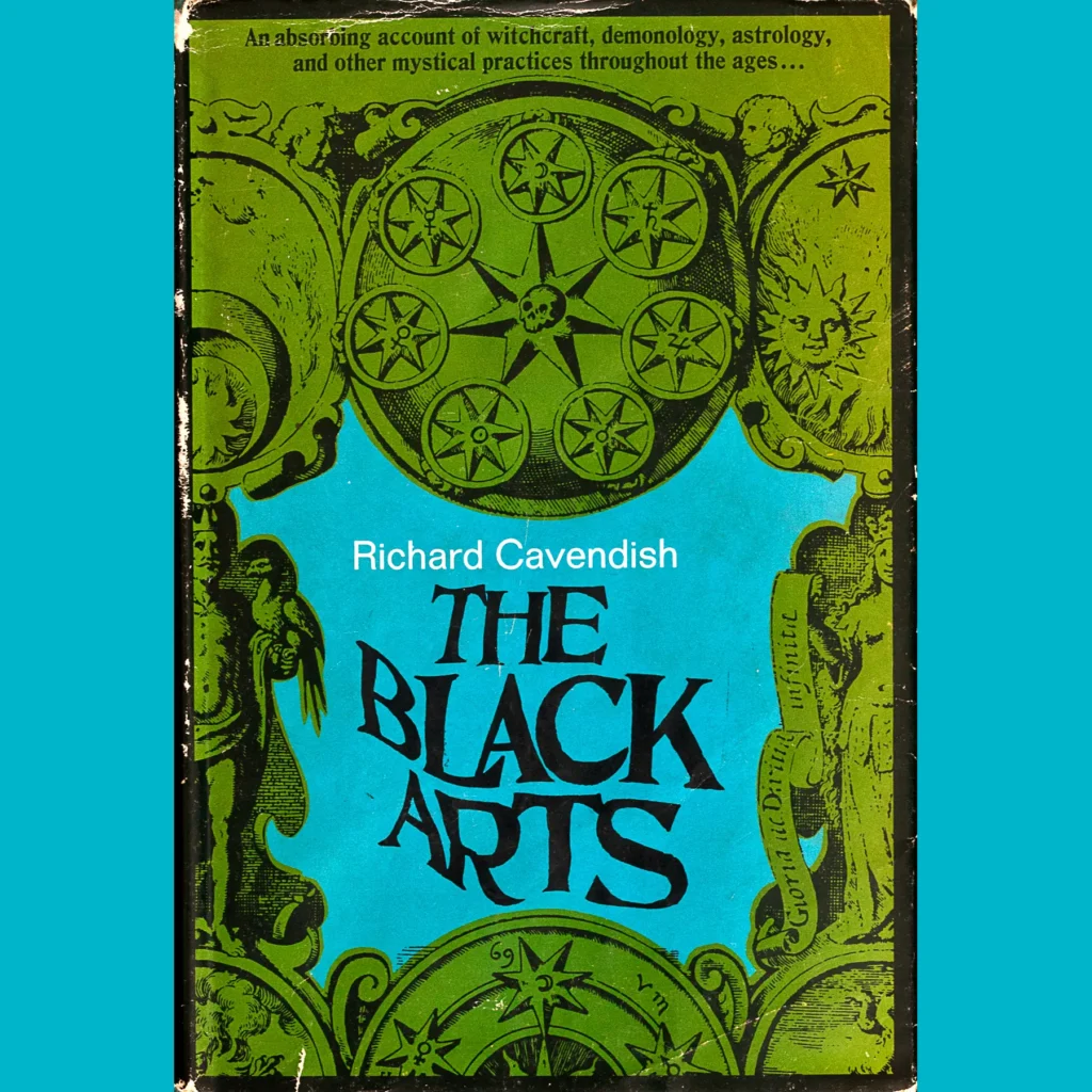
Love the dust jacket of the first edition. I originally read the 2000ish edition, which has a sort of swirl of ink-blot like monsters and is actually quite good and trippy despite being black and white. When I saw the 1967 cover, though, I had to snag it, the color scheme, that green and blue, layered over the old engravings with obscure symbols seems so perfectly of the period. And the distorted title, the letters twisted by invisible currents. It’s a beaut.