Hoo boy. This is the Planescape Conspectus (1996).
Look, if you know me at all, you’ll know that I adore Planescape. What I am about to say comes from a place of deep love and fierce protectiveness: this thing is fucking hideous.
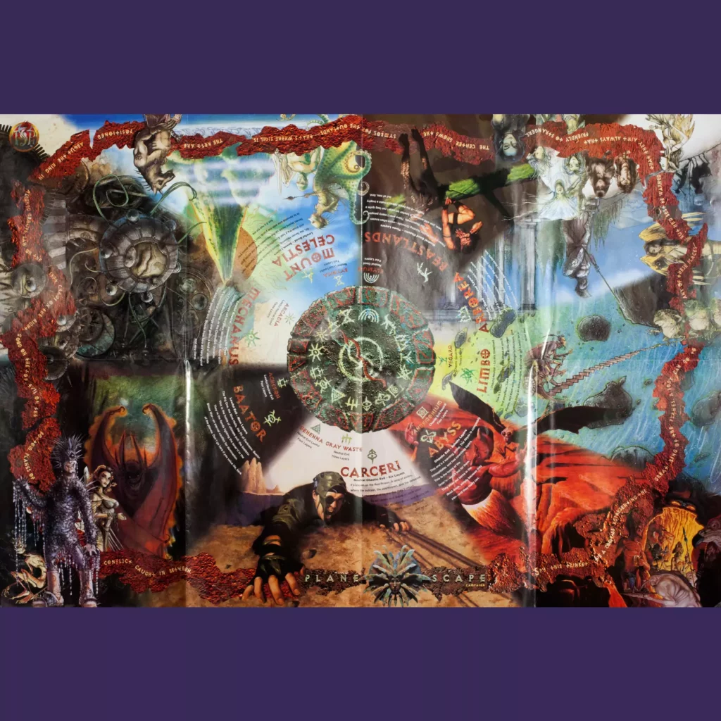
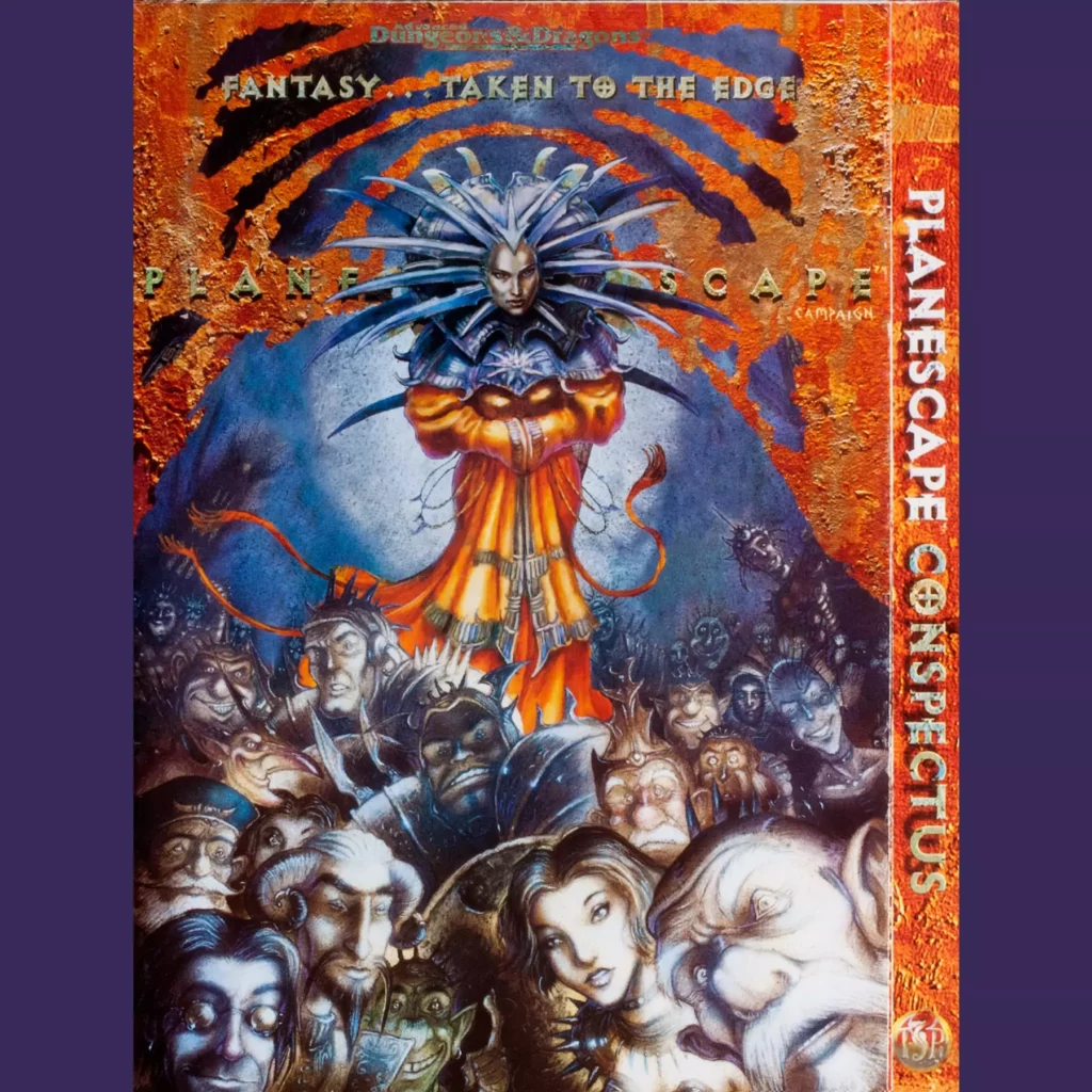
Now, of all the D&D campaign settings, I admit that Planescape is certain the Most Nineties in its design sense (Fantasy…taken to the edge!), despite the timelessness of Tony DiTerlizzi’s illustration work. That rusted metal thing is calculated to appeal to people who like Nine Inch Nails’ Downward Spiral. I know this, because I very much like Nine Inch Nails’ Downward Spiral.
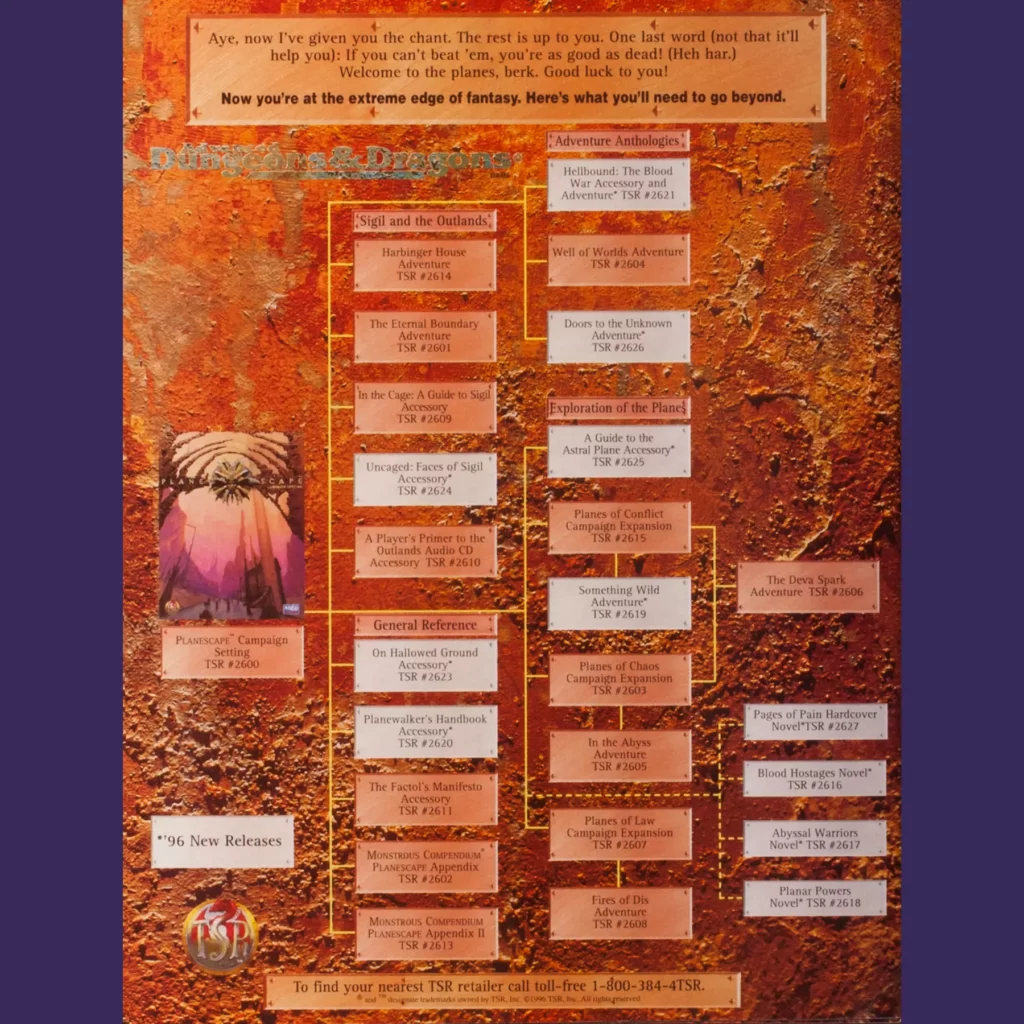
And really, most of this isn’t any worse than what we’ve already seen. In fact, this one has the best product tree – they wisely ditched the cover thumbnails and just made it all legible text! But the poster, dear god. I mean, just look at it. All that repurposed art, just shoved together (it doesn’t help that TD’s art is impervious to being masked for compositing). All that text splashed around like someone tripped and spilled their vat of letters all over the place.
I hate this. It takes everything interesting and beautiful about Planescape and smashes it all together until it becomes a meaningless, gaudy mush. And rather than present a pathway into a intriguing world, all this conspectus (and the others) does is underscore how wildly bloated and complicated all the campaign settings had gotten.
By the end of 1996, TSR was laying off employees, facing lawsuits from freelancers for lack of payment and was $30 million in debt. I can’t imagine what it must have been like as the company spun into its death spiral, but it seems to me that the series of campaign conspectuses offer a kind of physical representation or artifact of the doom that was coming.