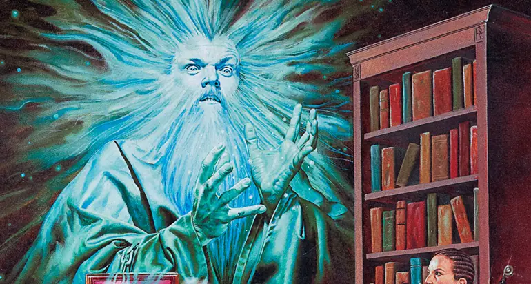
I have to admit, the Fred Fields cover painting for The Lost Shrine of Bundushatur (1998) doesn’t inspire much confidence. The adventurers look like college kids LARPing in hoodies and bedsheets at the university library. The ghost being both in front of the chair and behind the shelves really throws off the composition for me. The name Bundushatur is asking a lot as well. Too much? Maybe.
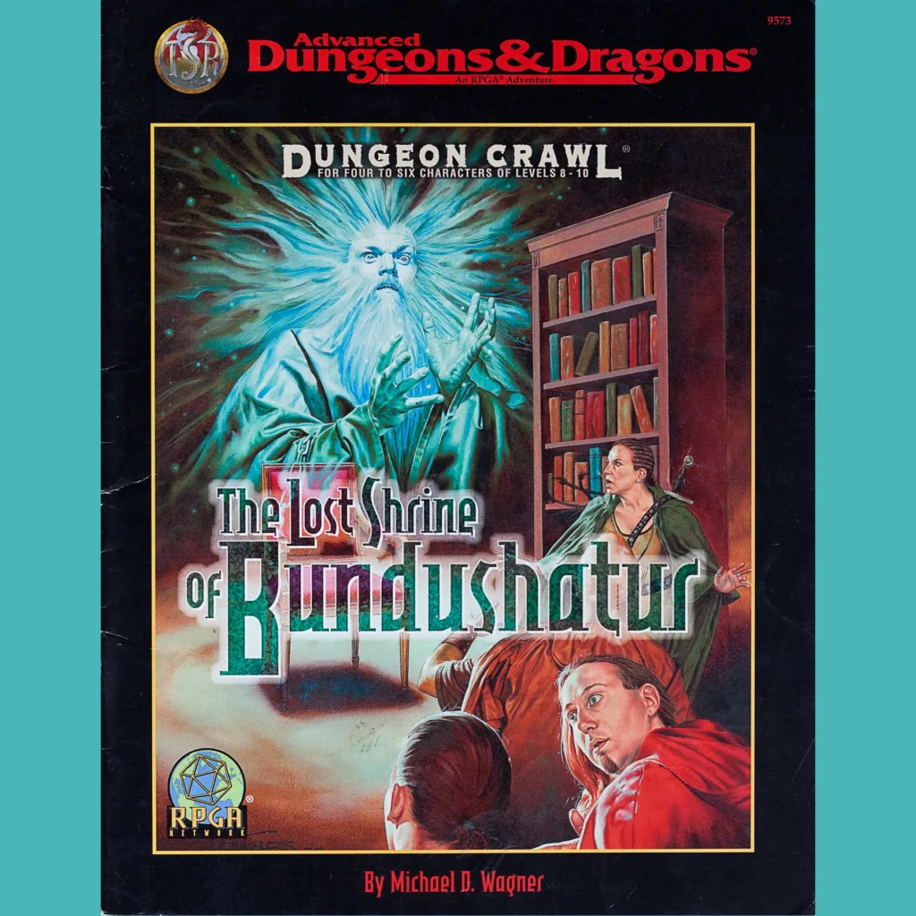
Anyway, this is one of the many latter-day “generic” D&D modules, indicated by the black trade dress, that were not bound to any particular campaign setting. By 1998, independent TSR was dead and Wizards of the Coast had not yet sold to Hasbro; there was a general sense of return to an older mode of design, as in A Paladin in Hell. Lost Shrine is a little different because it actually was old, originally written in 1987. It was resurrected as a larger push to get little-seen RPGA adventures in front of a wider audience (the RPGA logo on the cover started popping up a little earlier in 1998 and would return here and there until 2E wrapped up).
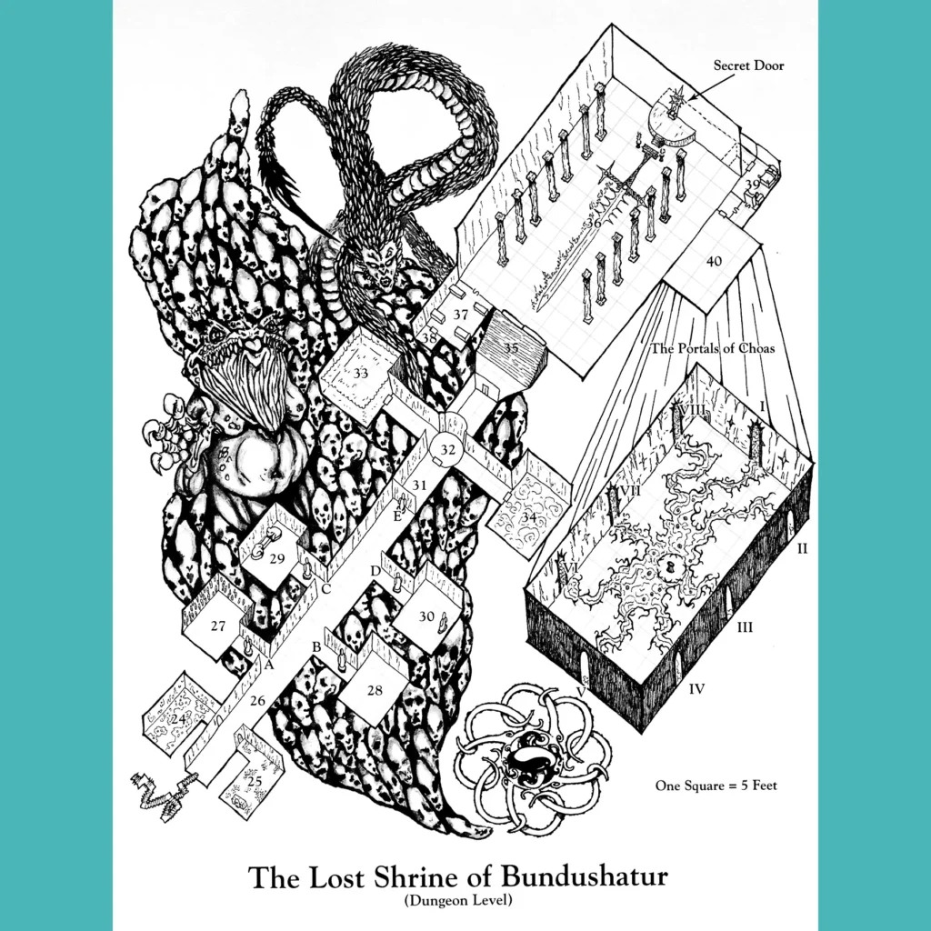
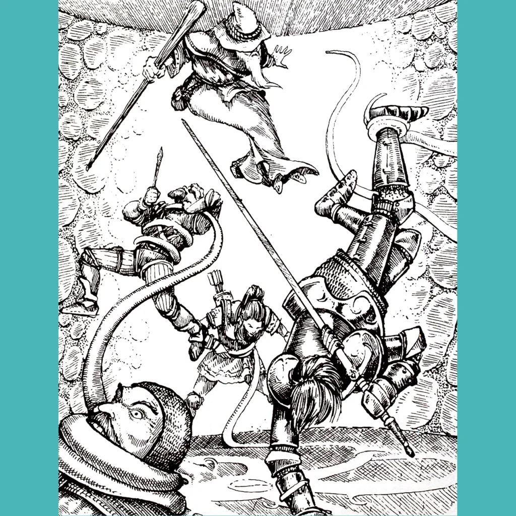
As the other cover branding indicates, this is primarily a dungeoncrawl into shrine of Chaos. It’s a relatively small space, made larger-seeming in its reality subverting weirdness. The idea is to go in, find the twelve parts of the chaos key, assemble it and use it to destroy the place. Bold to assume the players aren’t in the sway of Chaos, really. There are lots of shrines to Chaos lords and goopy monsters and interesting environments (an MC Escher inspired staircase is a highlight, as is the room with 50 tiny, hostile skeletons).
With the exception of White Plume Mountain, I can’t recall another D&D adventure quite so, uh, enamored of the work of Michael Moorcock. The chaos key is his eight-pointed cross, there’s a sword meant for a champion of chaos, there’s the many chaos lords and the winged apes and other stuff that seems lifted directly from the Elric and Corum stories. I don’t mind! But it does seem somewhat incongruous since D&D already had a supply of powerful agents of Chaos and I know, deep down, none of these lot will ever be heard from again.
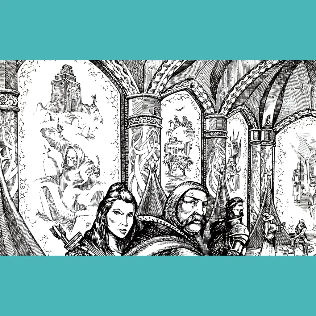
Arnie Swekel interiors. Arnie got a lot of work during this period, I think because his style seems old school without feeling old, if that makes sense. I enjoy his work generally, but I don’t think the material plays to his strengths. Best illustration: the tiny skeletons.

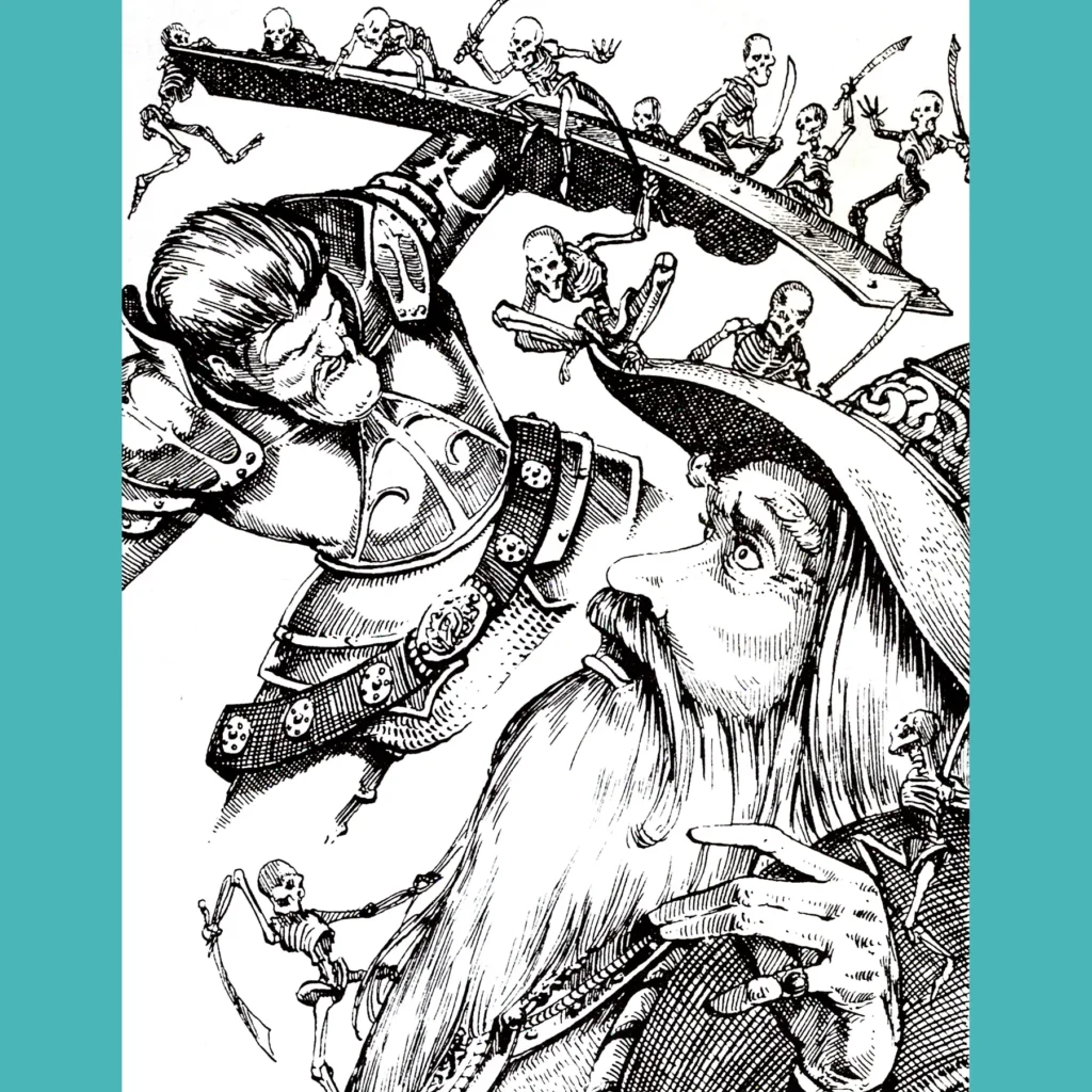


The ghost doesn’t bother me but you are spot on about the rest of the cover. Seems like a technically skilled artist relying too heavily on photo reference.